
When working with hierarchical data records, you can use the Data Record Tree Viewer to view the hierarchy when your developing the protocol, but what about if you want to show the hierarchy in a report? For this you have a couple of options.
First, you can use the native Tree component to show the hierarchy. This will look similar and be interactive like the view in the Data Record Tree Viewer.
If you want something a little more visual, then you can use the third-party application GraphViz, available here: Using GraphViz, you can create very nice looking charts showing your data record's hierarchy. Here is an example of what a simple chart would look like:
In this example, the Node Types are displayed at the top (school, course, student) and the property-value pairs are shown underneath, all in the same bubble.
An example protocol demonstrating both methods has been posted to the ScienceCloud Exchange and can be accessed directly here.
First, you can use the native Tree component to show the hierarchy. This will look similar and be interactive like the view in the Data Record Tree Viewer.
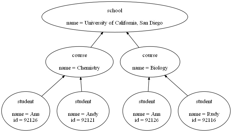
If you want something a little more visual, then you can use the third-party application GraphViz, available here: Using GraphViz, you can create very nice looking charts showing your data record's hierarchy. Here is an example of what a simple chart would look like:
In this example, the Node Types are displayed at the top (school, course, student) and the property-value pairs are shown underneath, all in the same bubble.
An example protocol demonstrating both methods has been posted to the ScienceCloud Exchange and can be accessed directly here.
